- The tea infuser I used was simple and really sturdy. I had a small round, ovalish container for the tea and a long hand coming from the top of the container. The handle and the top of the container screwed off to put the tea leaves inside.
- I believed overall all it worked well because it was easy to use, manage, and it did what it was suppose to.
- There were only one or two changes/adjustments that I think could be made. At the end when I was ready to clean the infuser, it was hard to screw the top from the bottom, but Im not sure that was due to how it was made or I had jammed it. I finally go it though. :) Another thing was the way the infuser sat/rested in the cup. It was sorta at a slight slant, but again Im not sure if it was of my cup or thats how it was. I guess I would need to see someone else use it.
- ROUGH ROUGH paint drawing for you guys can get an idea of which one I used. I promise my graphic stuff is better, haha.

Thursday, November 5, 2009
Tea Party
Article: Emotional Design
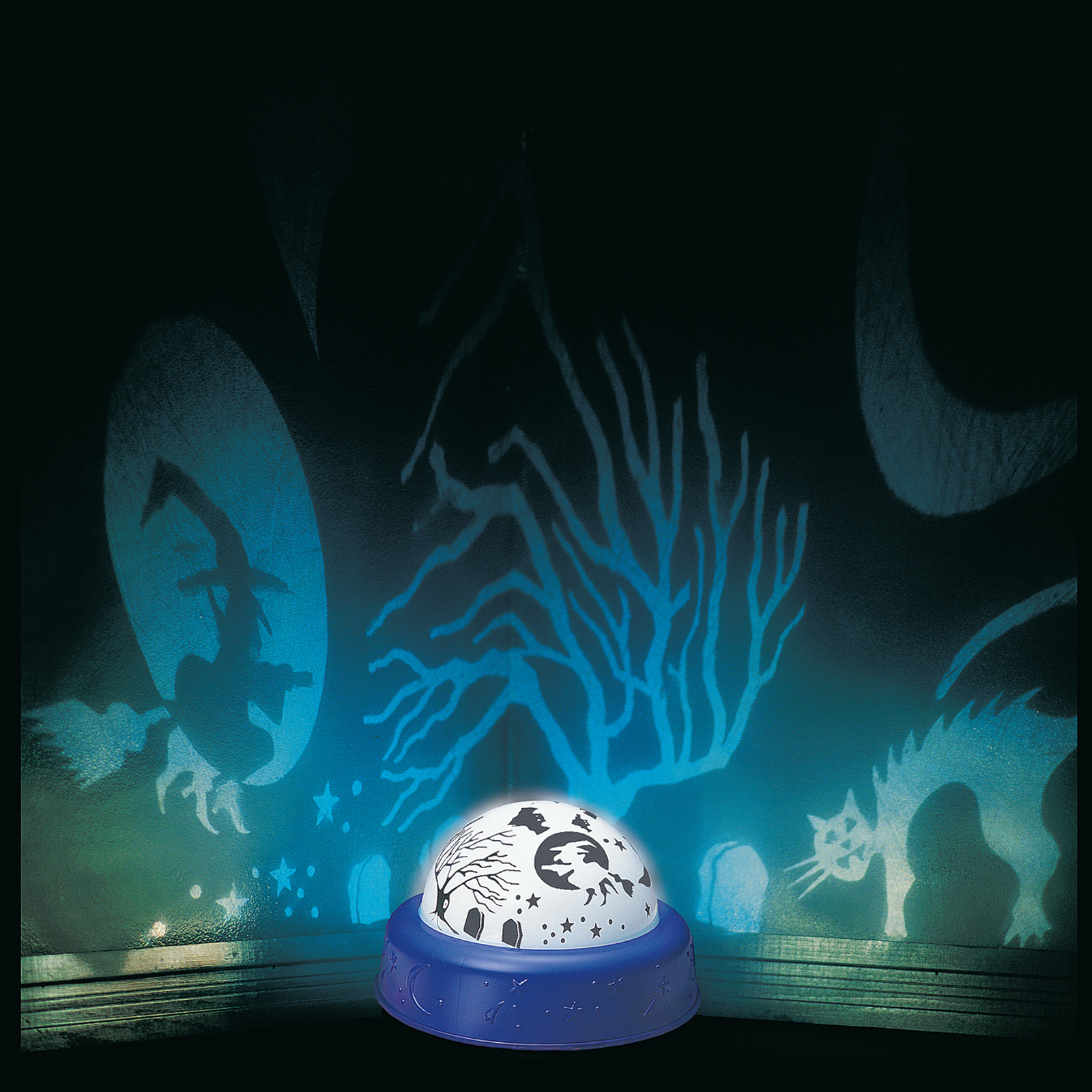
I found the article to be amusing and interesting. I agreed with almost everything in the article, especially how many artists/designers create things for the moment, for the trend, but once the customer buys it, it seems to go "out of date". I especially liked the passage about how the juicer wasnt intended to make juice. Although I'm not sure I would buy an item like a juice just for display, I liked that its intension was to start a conversation. Personally, Ive watched my mom buy lots of kitchen items and I dont even know what for and she always says for decoration. haha... Well when people come over the house, they admire the things she buys and after thinking about it, it really does start a conversation! Point is, lol, is that I think the article had a lot of good points and I loved how even the writer kept the reader interested to continue reading (or maybe it was just me)..... I was curious about how the Te o strainer looked like since the images were too dark so I looked it up and i LOVE IT!! lol..

Wednesday, November 4, 2009
Response to article
I want to address the first point in the article:
"Why must information be presented in s dull, dreary fashion, such as a table of numbers?... So Why not display the information in a colorful manner, continually available in the periphery of attention, but in a way that delights rather than distracts?"
As an artist, I do agree that a lot of data and media outside of my major would be more appealing and interesting if it were shown to me in a colorful, attractive way... Because this is what I know. My notes for biology are often decorated with doodles and sketches. But I do not think that all information should be presented in that way. The article argues that by making information more attractive, that people would be able to absorb more from it. But what kind of people are they talking about? Artists. What about the rest of the population? The non-artists. I know a lot of people that have no understanding in the point of art and get nothing from it. I also know there are people out there that get really really distracted by bright colors and cannot take in information unless it is all in black and white. Of course we all wish, as artists, that art and design could be a part of EVERYTHING we do, but me must consider the rest of the people we share a world with. Black and White is universal. I'm not saying that this shouldn't happen at all, it would make things more fun... just not to number charts and scientific data. Thats not our territory haha
emily d.


Tuesday, November 3, 2009


Friday, October 30, 2009
cheep ponoko 65% off yay!!!!!!!!!!
any one that has not ordered their ponoko stuff enter the coupon code EHV7TR it gives you 65% off making costs!!!!!!!! lol
Thursday, October 29, 2009


Emotional Design
It's the eternal debate, at least for me. Function over fashion, design over usability. While brilliant design draws us to an object is doesn't always hold our attention long enough to use the object past the initial purchase. Much like how I hate buying or wearing real winter jackets, why? because they're ugly. But my fashionable coats don't keep me warm and past the second week of november are no longer worn, relegated to the back of my closet only to be replaced by an ugly parka. While the gold-plated juicer is beautiful it's completely useless, the goal of emotional design is to draw the user in with good design sensibility and engage the user with proper usability.
Emily C
What I got from the reading was that a piece that is cute and functional is the way to keep the customer interested in the piece. Similar to the tea infuser it looks cute, at first it does not look like a tea infuser but is totaly functional. Also if the piece does not do what it is intended then it fails. Similar to the juicer it looks beautiful but is not functional so their would be no point to own a juicer that can't be used for juicing.


Emotional Design Reactions
I got a lot of information out of the Emotional Design excerpt by David A. Norman mainly about designing products that are seductive to the customer but also functional. What is the point of a beautiful product if all it is going to do is sit there? The juicer is a major example. A lot of time went into making that juicer and then they plate it in gold which will errode with use. Why not make it out of a plastic so that it could be used? Form follows function and he argues that aesthetics will lead to purchase but, after that what happens when you can't use it? It just goes into the back of a cabinet somewhere to collect dust.
I think this is very important to keep in mind with our tea infusers. Make something beautiful but, remember that it is supposed to WORK. It is supposed to make tea, therefore it should do such. It could be the most brilliant looking tea infuser in the world but if it does not work then it is no good.
I think this is very important to keep in mind with our tea infusers. Make something beautiful but, remember that it is supposed to WORK. It is supposed to make tea, therefore it should do such. It could be the most brilliant looking tea infuser in the world but if it does not work then it is no good.
Wednesday, October 28, 2009
tea infusers :)
i couldnt find many different examples, but these are ones that i found useful and that relate more to the ideas i have for my own. I was also looking for examples that are practical. I leaning more towards the ones that sit ontop of the mug and the chain ones (or however its called, haha)


 i thought this one ^^^ was interesting but wasnt sure how it worked....


 ^^^ i dont like the "extra" parts like the handle and spout because it seems not to do anything when you actually use it. (unless it again weight to it)
 ^^ i knew we're not using the mesh thingy but i just thought the design was simple.
Monday, October 26, 2009
Tea Infusers


I found a few different styles: the spoon, the container, and the bowl. I liked the spoons and the container types. There seems to be an antique model of the "tea pot" tea infuser. I think its cute but it's so overdone.
Sunday, October 25, 2009


Friday, October 2, 2009


Subscribe to:
Posts (Atom)